BattleChest - Gaming App

BattleChest - Gaming App

BattleChest - Gaming App

BattleChest -
Gaming App

Overview
Overview
Overview
Overview

BattleChest is a competitive gaming platform built for India’s rapidly growing esports community. The idea was simple: give gamers a place where they can enter tournaments, track stats, earn rewards, redeem winnings, and build a reputation across multiple titles like BGMI, Valorant, and DOTA 2.

The business needed a complete identity and a full product system, one that felt unmistakably “gamer,” but polished enough to gain trust for real-money tournaments. As the lead designer, I handled everything from branding and logo design to the entire UI/UX of the app, ensuring the experience felt cohesive, energetic, and tournament-ready.

Scope

Scope

Scope

Scope

Brand & Visual Identity Design, Logo Design, Creative Direction, App UI/UX & Prototyping

Duration: 45 working days

Year: 2023

Team & Contribution

Team & Contribution

Team & Contribution

Team & Contribution

Design Team: I led the design end-to-end: branding, concept development, logo creation, UX strategy, UI design, and prototyping. Antara Basu supported the project with design execution on specific screens and components under my direction.

Client: BattleChest Games

Client

Client

Client

Wanderlust Agency

Wanderlust Agency

Wanderlust Agency

Year

Year

Year

Year

2022

2022

2022

2022

The Challenge
The Challenge
The Challenge
The Challenge

BattleChest needed to stand out in an oversaturated gaming space where most apps look interchangeable. The team wanted:

  • A distinct visual identity gamers would instantly connect with

  • A logo that felt modern, strong, and timeless, without slipping into cliché futuristic gamer tropes

  • A simple, clear creative direction with static-only creatives to ensure the gaming community connects with the brand

  • A full-featured tournament app that could support onboarding, game ID linking, real-time challenges, rewards, payments, chat, profiles, and more

  • A UX that could handle high-density data (leaderboards, stats, payouts) while keeping navigation simple and “play-first”

Everything had to feel fast, confident, and built for heavy daily use. The kind of experience gamers instinctively trust.
Design Outcomes
Design Outcomes
Design Outcomes
Design Outcomes

Brand Visual Identity & Logo

The visual identity leans into the energy of esports: sharp angles, deep blacks, neon accents, and a futuristic vibe without being overwhelming.

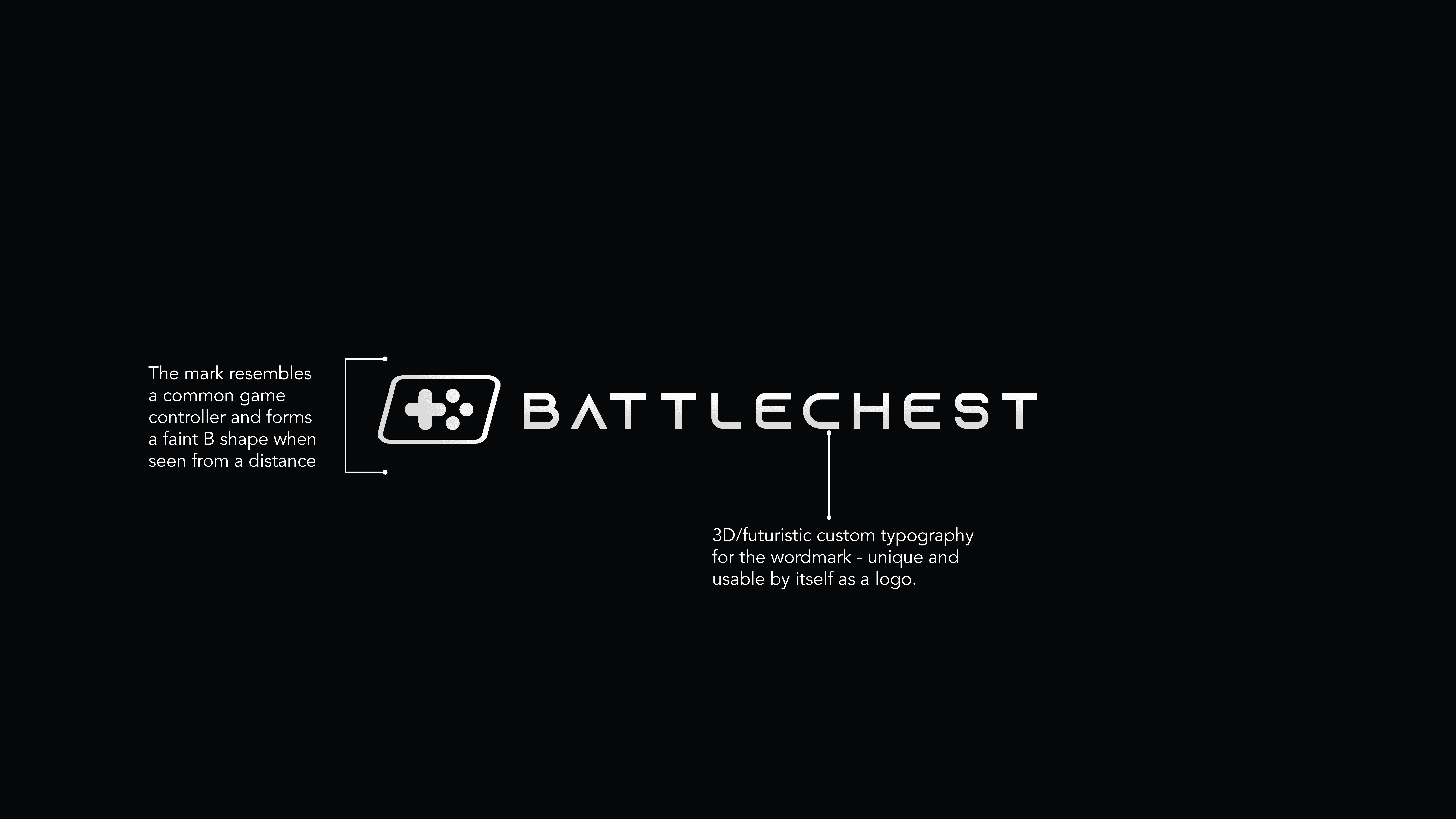
Logomark Concept
The logomark is built around two ideas:

  • A subtle game controller silhouette that feels instantly familiar

  • A soft, abstract “B” shape formed through negative space when viewed at a distance

This allowed the mark to feel iconic without being loud. A small discovery moment when users see the “B” inside the controller form.

Wordmark
I created a custom 3D/futuristic wordmark with beveled edges inspired by arcade typography and sci-fi UI glyphs. It’s bold enough to stand alone as a logo, which made it flexible for app icons, splash screens, social media, and merchandise.

Visual Language

  • Dark theme-first for immersion

  • Electric blues and neon accents for energy

  • Chunky, tactile buttons

  • Card-based layouts to mimic loot boxes and tournament banners

The entire brand was built to feel like a place where the user doesn’t just navigate, they play.

Onboarding

Fast login → player identity setup → game ID linking
Designed for speed, low friction, and immediate entry into tournaments.

Tournament Discovery

A modular card system that supports:

  • Multiple games

  • Entry fees

  • Prize pools

  • Tournament types

  • Room statuses

  • Filter-heavy browsing

The UI needed to feel intense but intuitive, something gamers instantly understand.

Challenge Participation

Including rules, room IDs, countdown timers, slot availability, and player metrics.
Each state (active, completed, waiting, won, lost) has its own visual language.

Leaderboard & Match Results

High-density data visualized cleanly:

  • Position

  • Finishes, assists, revives

  • Winnings

  • Player status

  • Match summary

The design emphasizes hierarchy and clarity in the moment players care the most: winning.

Rewards & Wallet

  • Coins

  • Chests

  • Spin-to-Win interactions

  • Vouchers

  • Payment integrations

  • Transaction history

  • Card & UPI management

This part of the app had to feel fun, safe, and rewarding in equal measure.

Community Features

Chats, friends, shared media, player stats, mutual tournaments, all wrapped in a social layer that makes BattleChest more than a transactional app.

Test out the app flows below or click here ↗ 
Result
Result
Result
Result

The final delivery gave the client a fully realized MVP — complete brand identity, logo system, app UI/UX, and dev-ready components.

The designs clarified the product vision, strengthened investor conversations, and created a complete blueprint the team could use for development and onboarding new stakeholders.

The identity positions Koray as a visionary yet grounded technology brand — an AI innovator rooted in engineering excellence. Over the duration of 4 days, we were tasked with creating a viable launch point for an entire brand. The logo, creative direction and overall brand tone was well appreciated by the client.

Key achievements:

  • distinct, ownable logomark derived from the core concept itself

  • custom typographic system that’s unique and future-proof

  • color palette that radiates clarity and strength

  • presentation system that merges tech emotion with industrial discipline

While the app did not progress to public release at the time, the work helped define the startup’s direction and provided a polished, scalable foundation for future versions.

Three hero creatives were developed showcasing the brand in real contexts, highlighting the logo’s precision, versatility, and elegance. Koray’s new identity visually communicates its purpose:

To illuminate and re-engineer the core of business through AI — with precision, trust, and forward vision.

Three hero creatives were developed showcasing the brand in real contexts, highlighting the logo’s precision, versatility, and elegance. Koray’s new identity visually communicates its purpose:


To illuminate and re-engineer the core of business through AI — with precision, trust, and forward vision.